
UX/UI, WEBSITE, PRODUCT DESIGN, USER RESEARCH, PROTOTYPING, USABILITY TESTING, FIGMANifarmed SLR: Designing a Responsive Website for a family-owned Pharmaceutical Company
Product Designer:
Danessa Santana (UX/UI Designer)
Stakeholders:
Jose Santana (CEO), Danica Santana (brand manager), Linda Garcia (marketing)
Project Scope:
80 hours~ January 2023
Background
For this project, I worked with a client, Nifarmed SLR, a pharmaceutical company owned by my family since February 1999 focused on importing and distributing medical and pharmaceutical products nationally in the Dominican Republic.
Our challenges were to define what/why our target users look for pharmaceutical websites, to ideate well-researched solutions for pain points, and identify the best practices that ensure we design a responsive website that will deliver on both user and client expectations.

Problem
Nifarmed had a brand redesign in 2018 but still lacks a website to direct their clients to, therefore, I want to help users learn about the company products, values & history, contact information, and their product offerings by creating a responsive corporate site that shows Nifarmed’s market offerings.
The intention is to place the company in the forefront of the market in terms of technology and to highlight their brand promises for their healthcare-based clients who are increasingly relying on their internet use to make purchase decisions for their businesses. We want to create an informative and modern corporate website that strongly communicates Nifarmed’s brand voice and competes with existing competitor’s offerings online.
Solution:
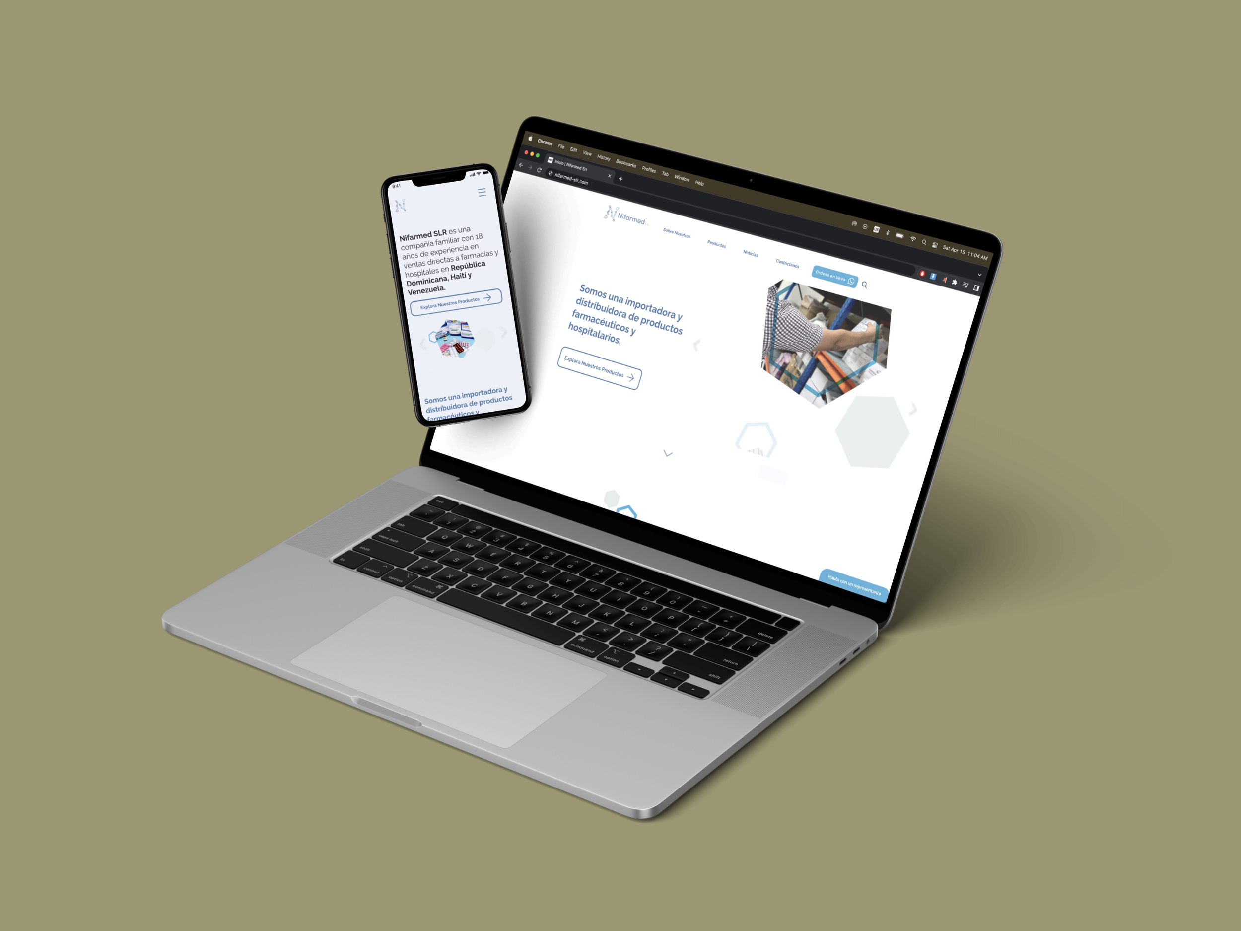
Based on our user research, 79,8% of the population in Dominican Republic has internet access through mobile and desktop computers at work or school, relying mostly on mobile for online navigation, therefore, I adapted and tested using mobile, tablet, and desktop adaptations.
Play video below for a walkthrough of the platform on desktop (video has no sound):
Context
As the UX/Product Designer, I worked on a Client Brief that would establish a baseline to understand the pharmaceutical industry, our client expectations and business goals, and finally defining their audience enough to create two provisional personas for recruiting interview participants later on.
Nifarmed’s main goal is to showcase their expanding range of products and to increase market share by adding a feature that can connect their customers to a sales rep instantly to ask questions about any products.
Empathize & Define: UX Research Goals
Understand what are the best practices for corporate websites with informational purposes in different industries.
Identify what content our user expects to find on Nifarmed’s website based on our competitors.
Discover which feature sets could improve users’ experience in our site when looking for information online.
Discovering Best Practices
The research led me to an initial list of Key Feature Set Proposals to brainstorm with the client based on tried and true “Best Practices” regarding usability, design patterns, and market standards.
I also gathered a list of Design Considerations for guiding us to ideal experiential results: Simplicity, Visual Hierarchy, Navigability, Consistency, Responsiveness, Accessibility, Conventionality, Credibility, and User-Centricity.

What we learned about our competitors
• Our competitors maintain updated social media profiles.
• Their websites contained corporate information content, as well as product listings, and a news section.
• Most had their distribution locations listed as well, which is something we want to add to Nifarmed LTR’s offering.

What we learned about our Users
We conducted User Interviews with 3 users that fit into our personas, and surveyed three employees of the company to get context from people working in the industry.
They are Doctors, pharmacists, department heads, and managers at pharmacies, clinics, and hospitals in Dominican Republic, aged from 27-70 years old of varying different education levels and technology access depending on the region.
User Research Takeaways
Most participants use search engines to different extents to find information about medical products regardless of their background and view information based on ranking (how close it is to being the first result on their search).
The users rely on social media to get a better sense of a company’s corporate values.
Our users access the internet on their phones, rarely on desktop computers or laptops. Use of tablets is limited for watching videos or files for work.
Insights
Most of our users require reading glasses, therefore we need to make sure the design is pleasing to the eyes and with good contrast on mobile.
Our participants prefer navigating on mobile due to its availability and ease of use regardless of their level of comfort/knowledge with technology in general.
Our users are more likely to trust a brand with updated social media presence.
They prefer clear navigation, nothing too flashy or heavy to load on slow internet.
Users want access to customer service without too many steps or having to provide personal information.
Ideation, Product Roadmapping, & UI Design
Ideation, Product Roadmapping, & UI Design
Site features
The ideas that came up during a small group brainstorming session were focused on connecting the user with product information.
The main features to come up in this session were:
WhatsApp click-to-chat feature
Product list
Distribution map
Sitemaps for A / B Testing
All the research findings led me to create two approaches to the web content: a shorter MVP (minimum viable product) version and a longer version that contains all the Nice to Have features.
The client selected the MVP version since they considered the structure more relevant. User research supports his preference as their goals lead them to the product listing page.
User Flows
Considering both our user goal of gathering product information and our business goal of customers reaching out directly to their sales team, I designed these graphs to decide which screens are needed to create a fully functional MVP to deliver our client.
Click on either graph to expand→
Designing the Site •
Designing the Site •
This digital overview of site sections was drafted in low fidelity to get a broad idea of what the sketches will look like and to identify layout inconsistencies.
Site Sections:
Putting it all together
-
![]()
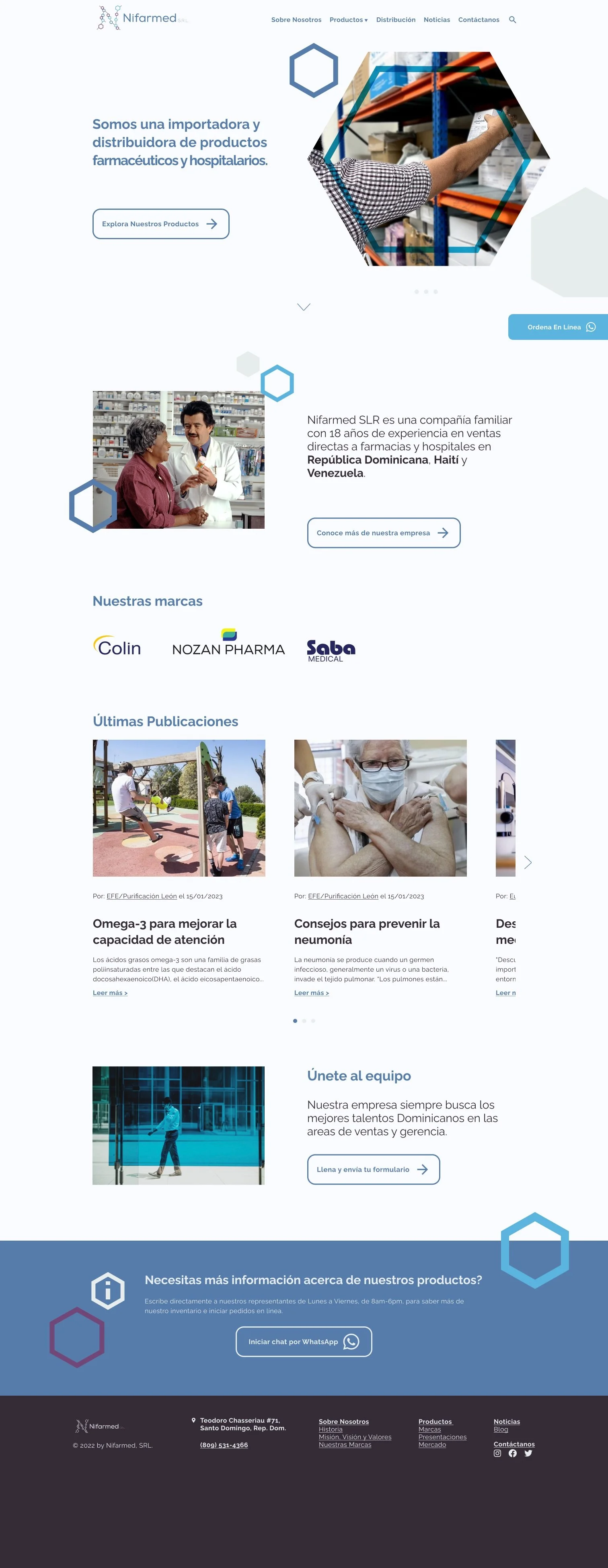
Homepage layout for desktop containing an introduction to the company, last news, and contact information
-
![]()
About section containing company history, values, and brands they offer.
-
![]()
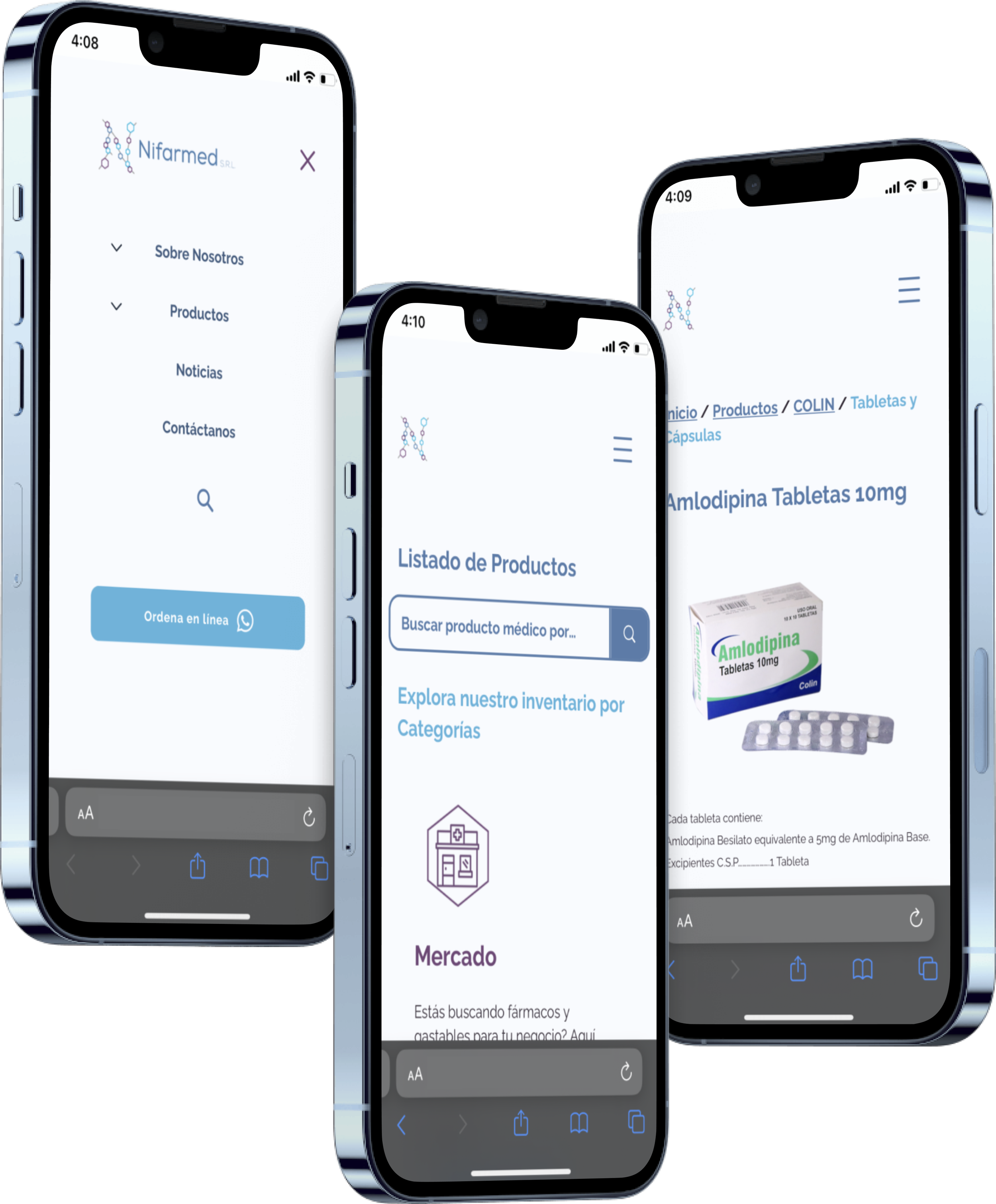
Products landing page containing a search feature and a list of product categories to provide two navigation paths for our users/
-
![]()
Search results page showing the amount of relevant results found, as well as suggestions when there are no results.
-
![]()
Product description, dosage, and CTA for our click-to-chat order feature
-
![]()
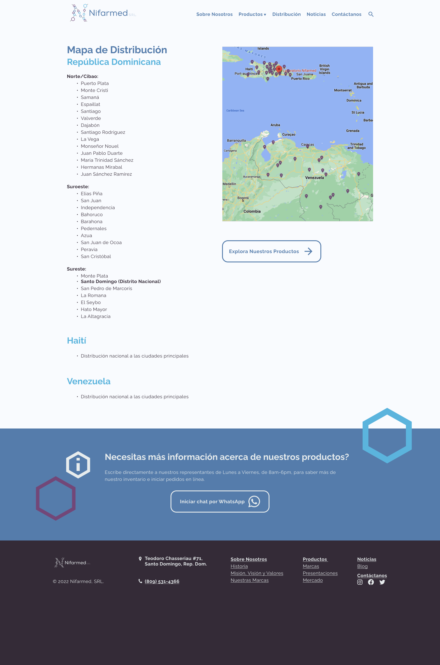
Distribution Map showing the regions they ship products to.
-
![]()
News site will contain relevant health and company-related news.
-
![]()
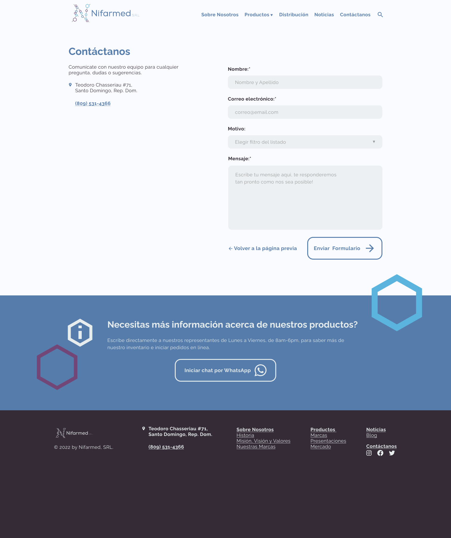
Contact form to direct job applications and other requests to capture users that didn’t want to use the WhatsApp feature.


Accessibility Considerations
Our users primarily access the internet on slow internet speeds, tend to use glasses, and come from a wide range of backgrounds. We want to make sure our site is:
* Perceivable: Visitors are aware of the content on your site.
* Operable: The functionality of your website should be possible in different ways.
* Understandable: All content and alerts can be easily understood.
* Robust: Your website is usable across different assistive technologies, devices, and browsers.

UI Component Library
The company rebranded prior to needing this website, therefor I had a solid branding to base my design on.
We kept the Raleway font family due to it’s legibility.
I kept the same color palette after confirming that it passed contrast testing for accessibility.
For icons, I went with simple, but recognizable, illustrations.
Click image to expand→
Usability Testing & Findings
The prototype was tested with 7 participants using on iOS, Android, ipad, and both laptop and desktop computers. I wanted to see their initial impressions, discover their navigation patterns, as well as pin point errors and future improvements.
Our users found the website visually pleasing and easy to navigate, with no issues to complete the given tasks.
There were no issues noted regarding visibility or contrast within our pool of participants.
We discovered that the search/product pages would benefit from adding extra filtering to shorten navigation.
Next Steps
-
Wix’s plug in is very limited in what we can do or how the search results look overall.
-
We have the language switch option available but still need to populate with translated information.
-
All the artwork and typographies were sent to the community manager, who will be in charge of small updates on the website
In conclusion, Nifarmed’s website is meant to begin a new era in the company’s history. We’re hoping this new website and their click-to-chat feature will result in increased sales and a better connection with their users.
Want to see the final product?
Click around our client’s website to see how Nifarmed SRL’s first website is functioning!*
*Some features are offline. Opens in new window.